Surface Grids & Lasers | Dev Update #4


Image: Interface prototype for Surface Grids data map.
Time for our round four update on the development status of Surface Grids and Lasers. If you haven’t seen them yet, check out Dev Update #1, Dev Update #2, and Dev Update #3.
A primer on Surface Grids for anyone not familiar:
It’s a feature we’re developing for Universe Sandbox (meaning it’s not yet available) that makes it possible to simulate values locally across the surface of an object. In effect, it allows for more detailed and accurate surface simulation and more dynamic and interactive surface visuals. It also makes it possible to add tools like the laser, which is essentially just a fun way of heating up localized areas of a surface.
Keep in mind this is a development log for a work-in-progress feature. Anything discussed or shown may not be representative of the final release state of Surface Grids.
Interfacing
In this update, we’ll take a close look at a part of the new user interface (UI) for the Surface Grids feature, specifically the data map. While the UI doesn’t affect the Grids simulation itself, it determines how easy and seamless it is to view and interact with the Grids feature. And as with other features and the experience as a whole, it is the UI and its accompanying user experience (UX) that ultimately determine how accessible and enjoyable Grids will be.
In previous posts about Surface Grids, we’ve shared screenshots that show a floating panel with a Grids data map, like this:

We had been using this panel for debugging, but it was never a representation of our end-goal for its design. We strongly believe that floating panels (the kind that can be dragged around the screen and can overlap) in applications and games can be very cumbersome; while they offer a lot of flexibility, managing them can become a task in itself. So instead of actually playing the game, you spend most of your time resizing them and moving them around to make sure they’re not in the way of the gameplay or other parts of the interface.
So instead, we try to create an interface where you don’t have to think about panels at all — where they’re intelligently docked, organized, and out of the way.
Below is a prototype that shows the Surface Grids data map first located within the Properties panel, then popped out to a larger view, then docked to the left. The panel is then duplicated and switched to a graph.
Disclaimer as always: Anything discussed or shown may not be representative of the final release state. It’s also likely this end-goal design (which is subject to change) will be reached over multiple releases.

Iteration Behind the Scenes
Dan is the creator and director of Universe Sandbox and he also leads the way in designing its UI and UX. Recently, Dan started using Adobe XD, a tool for designing, prototyping, and collaborating on UI/UX for applications. It has already proven a valuable tool in UI iteration for Surface Grids.
Designing for UI/UX can be challenging in its early stages because it’s often hard to get a sense of how it feels to actually use it until you can literally use it. Some things might seem great in design, but once you program it in, you realize that it lacks a certain flow, or feels awkward next to other interactions, and then it’s back to the drawing board. XD’s ability to create an interactive prototype can cut out this need to implement the UI for testing, which means it’s also easy to give others on the team a sense of what the designer is imagining. All of this can make the iterative process of design and feedback a lot faster and more efficient. (And no, this is not sponsored by Adobe! But we do enjoy their tools.)
Check out the interactive version of the prototype shared above: Interactive Surface Grids UI Prototype
This is very simplified and intended to only show new parts of the interface. You can click anywhere on the screen to highlight in blue the areas that can be clicked.
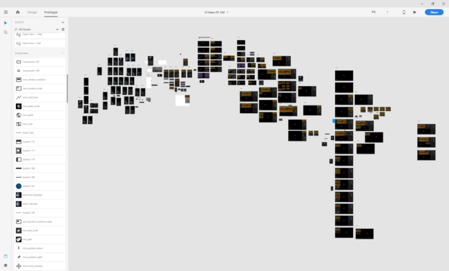
And here’s a behind the scenes look at Dan’s Adobe XD workspace for the above interactive prototype (large row on the right) and some other prototypes. Each rectangle is a different view of the UI, essentially creating interaction through branching paths triggered by click-areas.
What’s Next for Grids
We can appreciate that showing the UI may not be as flashy as a GIF of a molten Earth, but we’d like to show how much work and iteration, from all different sides, goes into a single feature.
Chris is continuing to work on the technical implementation, Jenn is working through the science, and Georg is gussying it all up — we’ll back in two weeks to take another look at our progress.
Bonus Galaxy Preview!
We’re really looking forward to Surface Grids, but let’s not forget the new galaxies that are coming. Here’s a preview showing some recent visual upgrades and the ability to see orbital paths for the individual galaxy particles.
