New UI Screenshot & Alpha 15 Update
User Interface Improvements
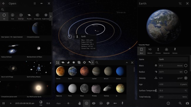
In the screenshot above you can see the improved Open, Add, and Properties panels. (Although you won’t usually have all 3 open simultaneously.)
The design will still change a bit as we continue development, but it’s a good representation of the direction we’re heading: unified icon styles, minimalistic design, better spacing, and a more intuitive organization of controls and settings.
One of our favorite new additions is the thumbnails in the Open panel, which provide a much more representative and inviting preview of the available simulations.
The biggest change? We’ve moved most of the actions you’ll need for exploring and interacting with a sim to a bottom bar. We pride ourselves on the amount of customizable options, but they’re only as useful as they are easy to find and adjust.
What else have we been working on since Alpha 14?
- Getting our newest team member up to speed
- A big welcome to astrophysicist Jenn Seiler!
- Jenn is currently working on improving volatile loss rates and implementing magnetic fields (look for these in future updates)
- Refactored physics and performance optimizations (see previous post)
- Transitioning to GIT for our source control
- This will help us maintain a monthly update schedule, as we can now develop features on the side without affecting the main project, then merge them in when they’re ready
- Improved graphics settings and options
- First steps in integrating backend visual improvements
- New tech which lets users heat up one side of a body (coming post-Alpha 15)
We’re working hard to get everything working again for Alpha 15. Keep your eyes peeled. We look forward to hearing what everyone thinks.
If you don’t own Universe Sandbox ², you can get instant access to the alpha through our website: universesandbox.com/2


about 10 years ago
I really want this version… So when you put a link for download?
about 10 years ago
You can already get instant access to Alpha 14 of Universe Sandbox ² through our website: http://universesandbox.com/2
Steam will automatically download Alpha 15 when it’s available.
about 10 years ago
Magnetic fields? w00t!!! 😀 What would they do in UBOX?
about 10 years ago
Initially they’ll be used in calculations for volatile loss, as the fields protect against solar winds. Further down the road they can factor into aurorae, and eventually stellar evolution, so we’ll be able to have pulsars and magnetars.
about 10 years ago
Will the effect of traveling near light-speed ever have an impact on the mass or relativistic interactions of objects? I know it’s still alpha but were there any plans on including such features?
about 10 years ago
Relativity is something we’d like to incorporate in Universe Sandbox ² at some point, but right now it’s not high on our priority list.
about 10 years ago
Are there any plans to integrate this with Kerbal Space Program? That would be badass, just saying.
about 10 years ago
No, no plans for that…
But you may be interested to know we’re planning on adding tethers, making space elevators and other structures possible. There’s no timeframe for these, but we’re really excited about them.
about 10 years ago
Do you have any plans for implementing weather in any future alpha updates?
about 10 years ago
Better cloud depiction is on our to-do list, though won’t be in an update anytime soon, and currently we do not have any plans for adding something along the lines of detailed weather systems.
We do simulate climate, though, and we are in the process of integrating more localized temperature calculations for planets.
You can read more about our climate simulation here: http://universesandbox.com/blog/2014/10/climate/
about 10 years ago
Hey.
Just wondering, why does the sun explode without turning into a giant? I have three, hopefully easy to add ideas for UBOX2:
1: Visible stellar evolution: A time speed that slows down and speeds up, depending on the stars age, that allows you to better see it evolve.
2: Evolution of White Dwarfs & Red Dwarfs: While it isn’t known exactly how they evolve, it would be fun to see them die as an optional feature.
3: Black Hole Improvements: It would be fun to see stars losing gas in tails and accretion disks.
Thanks!
about 10 years ago
i have alpha 15.1 can enyone explain plz.
please PLEASE add life in alpha 16 or alpha 15.2.
and add custom textures, hightmaps and clouds. and ufos.
(*-*) remember yoshi is FEMALE.
about 10 years ago
Thanks for the suggestions.
We’d like to add basic life simulation eventually, though we can’t say when this will be in Universe Sandbox ².
Custom textures is also on our to-do list.
about 10 years ago
I would love it if you could fix galaxies and saving. I really want to add galaxies but they do not work yet. And also like above, I would like some black hole improvements. Not only that but sometimes I build a huge solar system and I would like to save it but I can’t because I think the save feature has been taken out.
about 10 years ago
Thanks for the feedback.
Saving has been disabled as we couldn’t guarantee that it would work from one alpha version to the next. Now that we’ve released Alpha 15, we likely won’t be making as many changes that would break the Save/Load system, so we’re hoping to have it working again soon.
Improving galaxies is also high on our priority list.