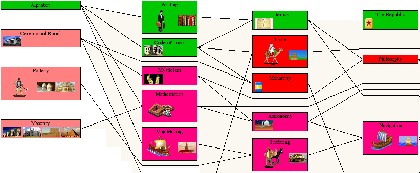
Nah, Minecraft graphics don't depress me. I think the world can look beautiful in that game. But this game looks like it's just filled with placeholders.
Look at this. It looks like something you could draw in MS Paint in 20 seconds, with Times New Roman as a font. That font should be forbidden.

The text is hard to read on those colored backgrounds, the images don't fit on the backgrounds, bla bla bla... I like their idea, and without knowing too much about the gameplay it looks good, but the graphics need some work imo. I simply wouldn't be able to stand looking at this.
The rectangles look like they have no rational basis for their size. The lines are confusing. I hope they're just placeholders and not some retro style they're using.
